Showing posts with label Preliminary. Show all posts

Thursday, 30 August 2012

Florence + The Machine; Rabbit Heart Music Analysis


The video starts off with an extreme close up of Florence’s mouth with the rest of her face covered by a piece of cloth. The camera then pans outwards as the cloth is lifted into a medium close up. This draws the audience’s attention to the opening lyrics of the song. The cloth covering her face has multiple connotations such as a possible desire to be unknown (as this was one of her first videos, she could potentially want to maintain a less well-known image) or be mirroring a wedding veil which then carries implications of joyfulness and sincerity. 

 However a few moments later a mid shot of Florence shows her removing the veil. This, therefore, maybe her showing rebellion or that she does indeed want to be in the spotlight. Her costume is a light silk material which creates a flowing movement in the wind or when it is being spun. This reflects Florence's characteristics of being somewhat of a 'free spirit' as well as conforms to certain indie conventions which her music, generally, seems to be. 

The frequent use of tracking close ups and medium close up’s are regularly used throughout the music video of Florence making her constantly the centre of the audience’s attention. This potentially implies that she is also the centre of the band 'Florence + The Machine' as well. As of present, Florence Welch is the only member of the band to have stayed since the beginning; the musicians have been changed a few times. The image on the right shows a significantly detailed use of cross fading, switching from a mid/ tracking shot of Florence dancing in the centre of everyone to a close up of her hand resting on the side of her face. There are potentially many reasons why the director chose to use this editing technique however one reason could be for textual or lyrical cohesion. The song 'Rabbit Heart' repeats the line 'Raise it up' multiple times which, I believe, to have some spiritual significance. This theme is carried throughout the video as another time she is pushed out to sea on a coffin-like box which has biblical references. Therefore, this combination of directorial, Mise-En-Scene and editing choices give the impression that Florence herself is somewhat religious or has her own spiritual beliefs which she intends to portray in her videos. 
The close up shots of interments such as the one shown in the video, a harp, conforms to the indie genre as a typical convention of indie music videos is that their videos contain frequent references or shots of instruments that the band is playing. Therefore this further insinuates that Florence has an indie aspect to her. However as their isn't a strong motif of shots of the instruments it could be argued that their is a certain pop element to her as well. Thus the video itself in terms on Mise-En-Scene and editing does give the impression of a indie style and genre.

Tuesday, 17 July 2012

DIGIPACK

Below are our final decisions for our DigiPack photos. Next to majority of the photos I have listed why the photo was chosen.

Being our favourite photo during the photo shoot and proven to be the best outcome after editing, we chose this photo as it fitted the indie genre perfectly. The bold, block capital newspaper headline accompanied with the faded font going across the photo as well as the black and white effect on top, it gave the impression that this was straight out of a newspaper; which, as a result of this, was our intended choice. We also added an overlay on the photo, which is where we combined two photos together to give, an almost, ghostly effect to the image. Therefore, due to everything listed above, the entire image can be 'interpreted' by the audience which is the bands overall aim; to be interpreted in different and individual ways. 


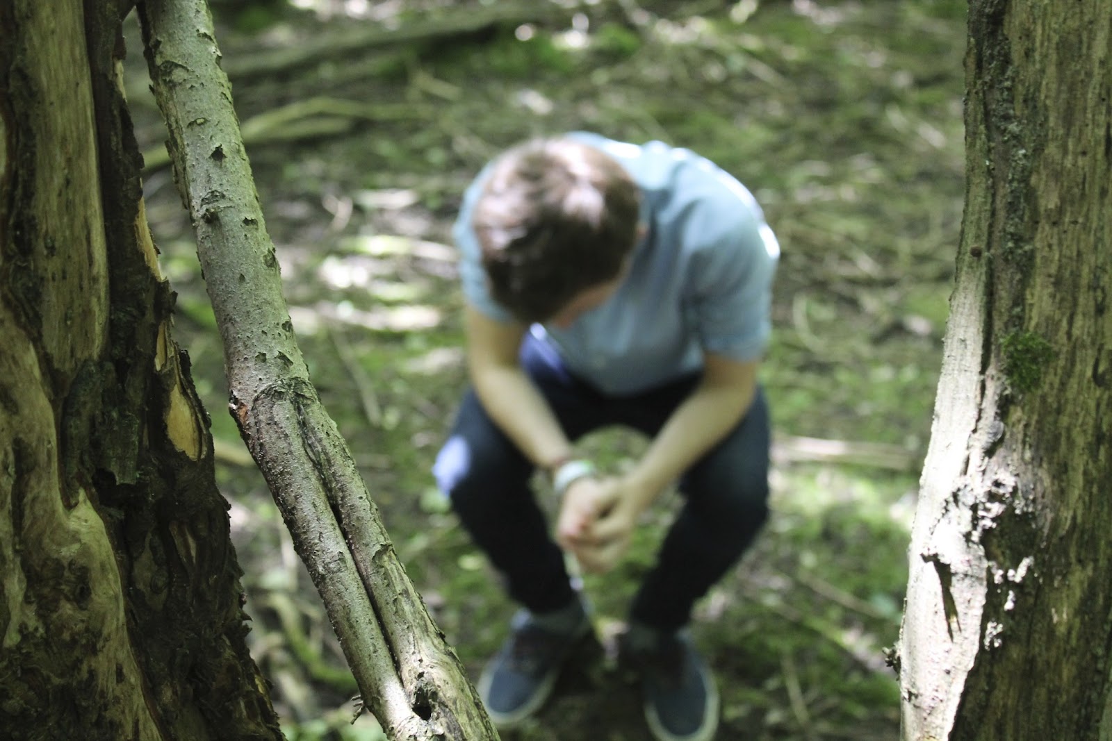
This was another one of our favourite images due to, firstly, the soft lighting in this image which emphasised the various green and brown colours in the background which overall, accentuates the nature; a strong, recurring theme within the band. Secondly, the absence of sharpness and the bokeh effect on the artist means that his distinctive features are out of focus and therefore allowing him to be interpreted, in terms of look, by the audience. Furthermore as the artist has his hands in a praying position, it implies a certain religious aspect to the band.

The vintage effect used here is a common and recurring effect used within the indie genre and due to the soft lighting which works perfectly alongside with the vintage filter. Yet again, the artist is not making eye contact with the audience for reasons unknown; another aspect to be interpreted. 
As mentioned in the previous image, this image also uses a vintage effect but includes more hard lighting to give the almost spot light focus on the artist. Also, the use of the low angled shot makes it seem as if the artist is performing to his audience and looking down on them but not in a degrading way. 
Here, we removed the vintage effect and replaced it with a black and white one to fit with the newspaper style theme. The hard lighting blocks out the artists's face and replaces it with a shadow-like outline; this therefore makes him seem unidentifiable to his audience. 


This image includes the bokeh effect again as it focuses on the branch going across the image highlighting the nature theme. The artist is left of centre in this shot and appears to be kneeling down and looking up. This is to encourage interpretation with what he is looking at for the audience.
This image was one of the overlayed images used in the front cover. The low angle shot makes the artist seem as if he an important figure within the band. He is also staring out into the forest, away from the camera, but what he is looking at remains a mystery and therefore carries on the theme of interpretation within the images.

The final inlay is my favourite image. The combination of hard lighting in the background of the shot makes the trees seem darker and almost imposing on the artist. As a result of this, this accentuates the soft lighting on the artist which is created by the beam of sun on the artist. The sun light almost gives the impression that the artist if chosen as it creates a rather confined circle around him. The artist is also positioned away from the camera, removing all connection with the audience as done in previous images. His head is also positioned facing up at the light, as if he is, in a way, embracing the light. The bokeh effect is used once again to blur the nature in the background which gives the impression that nature itself is moving around him. Therefore subtly bringing in a magical atmosphere. 


The back cover of the DigiPack moves away from the nature and newspaper theme as seen in previous images and instead takes on another indie convention; watercolour. The image is a drawing of half the face of the artist and the 'running off' of the watercolour paint gives the impression that the artist is reaching out to his audience. The song names used as well are rather ambigous and hard to figure out what the song would exactly be like. Therefore each name, especially 'only glamorous in retrospect' and 'language of the people' are open for interpretation by the audience. Despite the image being in watercolour, this is the only image used throughout the DigiPack where the artist is making eye contact with the audience. 

Sunday, 15 July 2012

DigiPack Front Covers

Some potential ideas for the front of our DigiPack

This image, being one of my favourite as of present, conforms to the indie genre conventions as, rather obviously, it stands out independently and mirrors a newspaper format due to the faded text going across the image and the bold, centered heading accompanied by the smaller sub-heading. The black and white effect adds to the newspaper style.


In this image, as the black and white effect and the faded text is removed the overlayed image is a lot clearer. The overlay effect makes the image harder to recognise and distinguish the two images being put together; thus allowing for it to be 'interpreted' in various ways which is the aim of our group. The overlay effect also gives the impression of the passing of time of that particular spot, people sitting at the exact spot in different positions and looking out. Therefore that clearly shows how it fits with the indie conventions as it's completely independent and unique.


I am really pleased with the light in this image and the sharpness of the shot. The light from the sun coming through the trees creates this nostalgic atmosphere as well as darken the shot to make the image more ambiguous. In terms of sharpness, as the focus is on the tree trunk (potential place for album name/band name) the image of myself (the artist) is blurred and avoiding details of any facial features which implies that the band is not wanting much attention or that as the artist is unidentifiable it could imply that the person in the shot could be anyone; therefore giving the impression that the band is trying to communicate to a wide variety of people or that a wide variety of people will enjoy their music.


Lastly, the use of the black and white effect in this shot creates an authentic and polaroid style of shot which conforms to the indie genre. The rusty vehicle being sat on was unusable and old which gives the impression that the music will be aimed at an older audience. The vehicle does have 'advance' imprinted on the front of it and this would be a great album name as it looks authentic and the way the text is layed out (starting small and increasing in size as it moves in) it can be interpreted that there is an advancement of the band or that they are advancing forward with their music; possibly revolutionising indie music or genre. The red streak which has been edited on highlights the artist of the band, making him seem more important and a significant figure. The red streak also looks like a camera flare which is a common feature within indie album covers.

DigiPack Back Covers


Various potential ideas for the back cover of our DigiPack


Wednesday, 11 July 2012

Finished Preliminary Video

We finally finished our preliminary video for Ben Howard's Keep Your Head Up


Tuesday, 10 July 2012

Monday, 9 July 2012

Digipack Song List

As we are making the most authentic digipack possible, an obvious inclusion is the song names featured on the pack on the digipack. Therefore we came up with 12 song titles which are as followed:

  1. Humble
  2. Only Glamorous In Retrospect 
  3. Problems The Problem
  4. Visualise
  5. Language Of The People
  6. This Isn't Even Wrong
  7. Our Utmost
  8. Keeping Up With Yesterday
  9. Capacity
  10. Advanced
  11. Sometimes By Chance
  12. Injustice

Monday, 2 July 2012

DigiPack Photo's

While planning for our digipack cover/ album cover we talked about using an original indie style in terms of album cover and use water colours. As mentioned in some of my previous posts, water colours are used frequently with indie bands and therefore we decided to see how it would look. Rubie was able to draw up a water colour sketch to the other side of the photo we took of myself. Below is that picturelkztw.jpg

DigiPack Photos

On the Thursday 28th of June my group went out to film our preliminary task of Ben Howard's 'Keep Your Head Up' as mentioned in previous posts. However, as the weather was in our favour and the sun shinning through the trees gave us such a spectacular variety of light and colours to work with so, as a result of this, we decided to take some DigiPack photos for our album cover. As we are conforming to the conventions of the indie genre; we edited the photos using various vintage filters and black and white techniques which allowed us to fit into the indie genre. Below are a few examples of the shots we took:

Wednesday, 27 June 2012

Indie Band Name

As shown in a previous post, I have done some research into established indie bands and their specific names and reasons for choosing them. As part of my coursework I, with the help of other people, will have to create a music video and therefore that music video will be from a band and that band will need a name. So, after a while of coming up with different and possible band names we finally decided on one: 'The Interpretation'. We decided on this because being an indie artist is all about being independent and unique. Therefore calling ourselves The Interpretation it portrays that our music can effect people and is open to individual interpretation as well as allowing listeners to perceive it in their own way. Therefore 'The Interpretation' illustrates our overall aim for the music; to be interpreted by the individual listener.

Preliminary Task Shot Timings & Props

We decided to completely break down Ben Howard's Keep Your Head Up and timed how long each camera shot lasted for and the props which could be seen in each shot. This will help us to recreate the video  more effectively and hopefully be able to mirror the original more accurately. Below is the poster showing this:

Recreation of a Music Video

Location
In order to find recreate Ben Howard's Keep Your Head Up music video as well as possible we've decided on a field and forest located in Great Barfield; this will hopefully match the location of the original video.

Filming Schedule
The date of which we will film is Thursday 28th of June from 12:30 pm up until approximately 9:30 pm. The reason for us filming late is that the video itself starts at sun rise but as we are unable to film early in the morning we decided that the sunset should hopefully give us the same effect. Furthermore, having checked the weather for this day and the time of the sun setting, we should be able to match the weather of the original video.

Prop and Equipment List 
In order to recreate this video we will need the following equipment and props: a black bucket, handheld camera, tripod, bubbles, bubble maker, a shovel and a spade. 

Actors
As Ben Howard is a male and the only person seen within the first minute of the video, I will be acting his role as I am the only male in my group. 

Preliminary Task: Recreating A Music Video

As the title illustrates, my preliminary task is to recreate a minute of an artists music video. Due to my interests and love of indie style music, Ben Howard's Keep Your Head Up was what I decided to do. Below is the video for that song:


Reasons for choosing Ben Howard - Keep Your Head Up
My reasons for choosing this particular song are as followed:

  • As our preliminary task states we only have to film a minute of the song and the first minute of the video is relatively easy to both recreate and act out. However our main issue will be with the editing, as their is a strong edit on colour and lighting within the first minute so recreating that will prove a challenge.
  • The song fits perfectly with the Indie genre as it as an absence of auto-tune (a common factor within mainstream artists), relies heavily on the use of instruments; in particular a guitar and also the video is independent as it is a more relatable and 'normal' occurance (which indie is all about) rather than a mainstream video which would be typically set in a club.  
  • The location/ setting is in a field and a forest with a stream or lake of some sort. As we have suitable locations in the surrounding areas of where we live, finding a similar place to film should be easy enough and should cause much distress.
  • In terms of Mise-en-Scene, the props we need to use are simple as they are: a shovel and a sack. In terms of costume, the artist wears rolled up jeans and a plain t-shirt which portrays a casual, down to earth impression and therefore should be easy to mirror.  
  • The camera shots are mainly an array of close ups shots, tracking shots, mid shots and POV shots which will provide minimal difficulty in recreating as myself and other group members are all familiar with using cameras. 
  • Throughout the entire the video, the artist chooses not to have shots of him singing and focuses more on his actions and movement in the video. Therefore, as I will be performing the role of the artist, I will not have to work on perfectly mirroring the artist singing as well as working on my ability to mime. 

Shot List: Ben Howard - Keep Your Head Up