This image, being one of my favourite as of present, conforms to the indie genre conventions as, rather obviously, it stands out independently and mirrors a newspaper format due to the faded text going across the image and the bold, centered heading accompanied by the smaller sub-heading. The black and white effect adds to the newspaper style.
In this image, as the black and white effect and the faded text is removed the overlayed image is a lot clearer. The overlay effect makes the image harder to recognise and distinguish the two images being put together; thus allowing for it to be 'interpreted' in various ways which is the aim of our group. The overlay effect also gives the impression of the passing of time of that particular spot, people sitting at the exact spot in different positions and looking out. Therefore that clearly shows how it fits with the indie conventions as it's completely independent and unique.

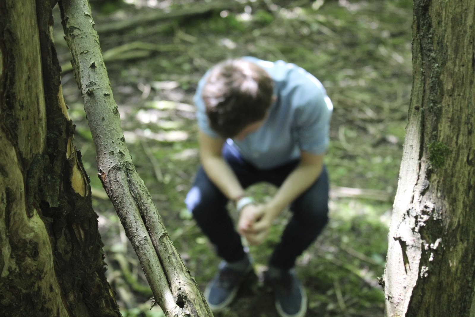
I am really pleased with the light in this image and the sharpness of the shot. The light from the sun coming through the trees creates this nostalgic atmosphere as well as darken the shot to make the image more ambiguous. In terms of sharpness, as the focus is on the tree trunk (potential place for album name/band name) the image of myself (the artist) is blurred and avoiding details of any facial features which implies that the band is not wanting much attention or that as the artist is unidentifiable it could imply that the person in the shot could be anyone; therefore giving the impression that the band is trying to communicate to a wide variety of people or that a wide variety of people will enjoy their music.

Lastly, the use of the black and white effect in this shot creates an authentic and polaroid style of shot which conforms to the indie genre. The rusty vehicle being sat on was unusable and old which gives the impression that the music will be aimed at an older audience. The vehicle does have 'advance' imprinted on the front of it and this would be a great album name as it looks authentic and the way the text is layed out (starting small and increasing in size as it moves in) it can be interpreted that there is an advancement of the band or that they are advancing forward with their music; possibly revolutionising indie music or genre. The red streak which has been edited on highlights the artist of the band, making him seem more important and a significant figure. The red streak also looks like a camera flare which is a common feature within indie album covers.